
News April 2, 2026
New custom charts available on RAWGraphs
We have some updates for our users. Three new custom charts ready to be loaded in RAWGraphs: Ridgeline plot, Dumbbell plot and Radial line chart!
We have to thank Daniele Ciminieri for this valuable contribution and to share his work with us.
Ridgeline plot
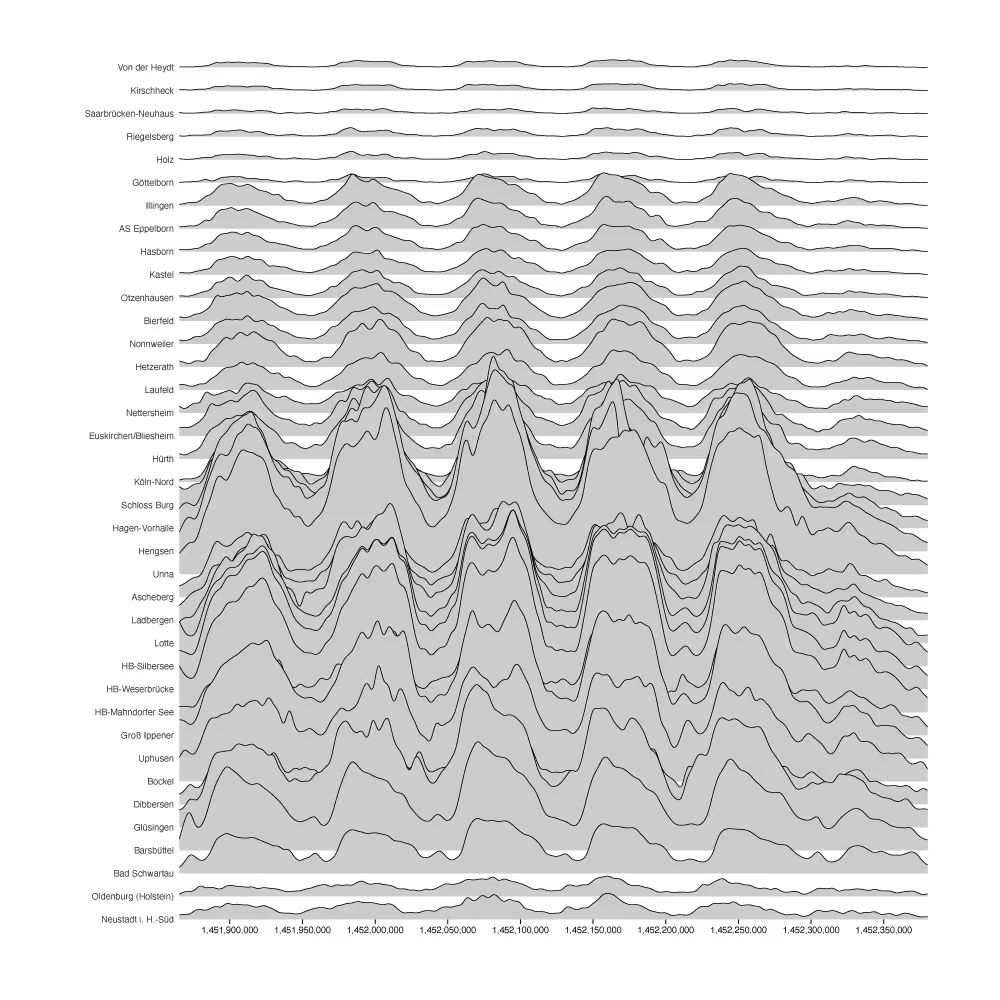
A ridgeline plot showing weekly traffic in different areas
A ridgeline plot (also known as a joy plot) shows the distribution or temporal evolution of several groups over a shared continuous axis. Each group is rendered as a filled area with an optional stroke, stacked vertically with a configurable amount of overlap. The overlapping layout makes it easy to compare many series at once while preserving the individual shape of each distribution. The chart is inspired by the D3 Ridgeline Plot by Mike Bostock.
Dumbbell plot
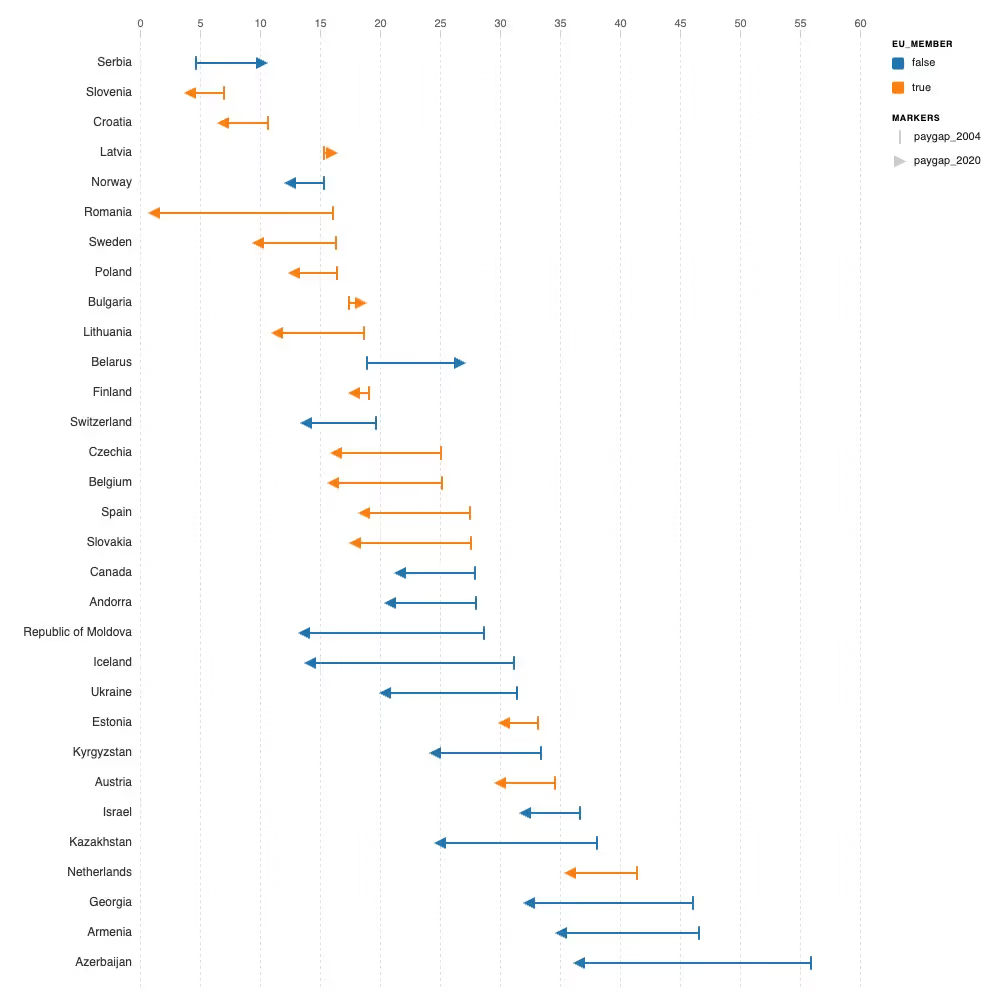
A dumbbell plot showing gender paygap between 2004 and 2020.
A dumbbell plot with two values compares two numeric measurements for a set of entities. Each entity is represented as a horizontal line segment connecting the two values, with configurable markers at each end (circle, square, arrow, star, or vertical line). The gap and direction of the segment immediately communicate the magnitude and direction of change between the two readings. The chart is particularly effective when comparing values at two points in time, between two categories, or across two conditions. Sorting rows by difference, by one of the values, or alphabetically makes patterns and outliers easy to spot.
Radial line chart
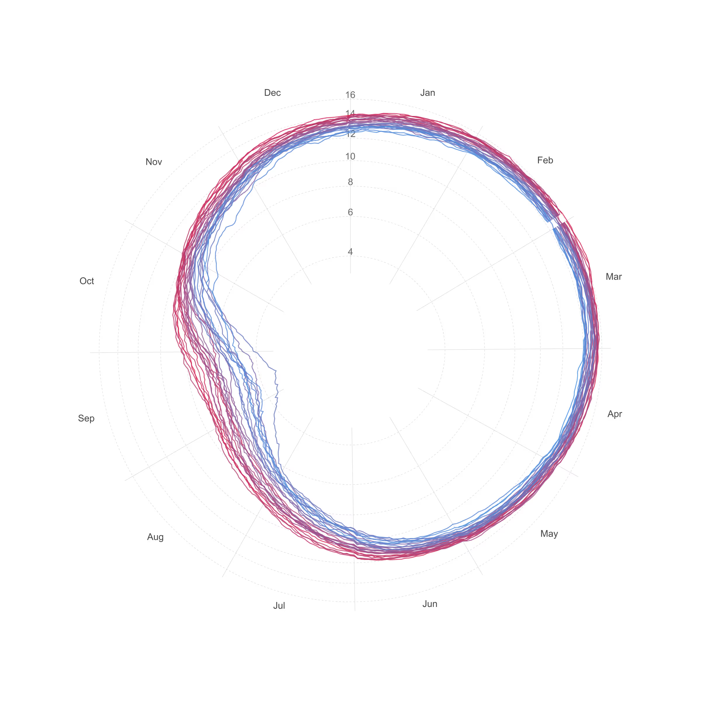
A radial line chart showing historical temperature of sea ice.
A radial line chart is a circular visualization designed to display time-based data with a cyclical structure, such as hours of the day, days of the week, or months of the year. Values are plotted along a circular axis representing the progression of time, and connected to form a continuous line that wraps around the center. This layout makes it easier to reveal recurring patterns, seasonal trends, and periodic fluctuations that might be less visible in a linear chart, highlighting how values change across repeated time cycles.
What are custom chart?
Custom charts are pieces of code that can be loaded on the fly by the RAWGraphs app, extending its possibilities.
Let's consider an example. In RAWGraphs, you can create bar charts, grouped bar charts, and even stacked bar charts. However, population pyramids were not available. Imagine if someone decided to create such a chart. Wouldn't it be nice to be able to reuse it without having to code it again?
Until now, using charts created by someone else was possible but a little bit tricky. You had to clone the source code, modify it, build it, and host it on your own server.
With the new version, we have defined a grammar that can be used by third parties to code charts and load and use them directly within the RAWGraphs interface.
To know more about custom charts check this post.