Gallery
A place to showcase the best examples of RAWGraphs in use

The medal race
submitted by
description
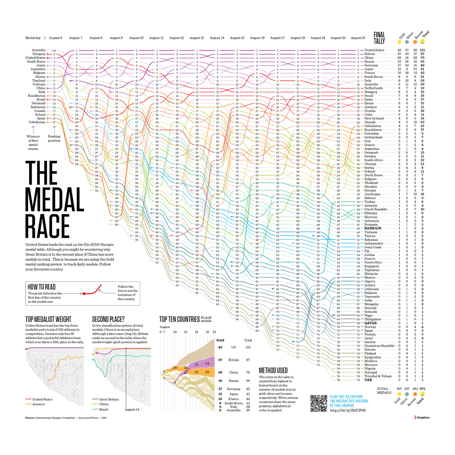
In Rio 2016, we tracked the number of medals won daily and the journey of each country in the positions of the table. It was interesting to see how media coverage uses different ranking systems. The United States media used the sum total of medals to position their delegation always first and they were unbeatable, while British and Chinese fought the second place using different systems of ranking in its favor. We wanted to demonstrate the differences in this visualization and, although there is no official counting system, we were finally guided by the system of gold medals.
charts used
Bump Chart
